Legal Aid at Work Logo Design
Renaming

It is a great honor and pleasure to rebrand Legal Aid Services, the first organization of its kind in the west that committed to provide crucial free legal services to low-income people for more than a century. The goal of this renaming and rebranding project is to help Legal Aid Services to put justice to work as far as possible for its clients and communities.
First of all, we helped Legal Aid Services, specialty in enforcing and strengthening workers’ rights, find a more direct and specific name, Legal Aid at Work, as a better researchable and reachable organization.
Logo Development - Grid and Shape
It’s all started from a simple grid system that is not only similar to their existing logo, but also considering its symbolic meaning to carry out the message. A square—the shape of stability—is a familiar and trusted shape that suggests honesty, conformity, peacefulness, solidity, security, and equality.
Typography logo is the most direct and fastest way to introduce a brand, since the name IS the graphic. Building the typography logo into the grid became the perfect direction to go. Meanwhile, rounded corners are also added to increase the readability.

Refinement
To decrease the bulkiness of the logo (in yellow), the height of all horizontal strokes are shortened (see the logo on the right) to increase the negative space. The x-height of all the letters is increased to create a “long legs” slim feeling.


Then, the kerning and tracking have been adjusted to balance the negative space in between letters. The letters are not strictly follow the grid anymore.

The letter like like L and E, they have more open space on their right side, so the space between L and E is about 75% of one grid column, so is the space between E and G. For the letter G and A or A and L, the shape of the letters are more closed, so the space between them are wider, 100% grid column. Same rule applied to A and T on the second row. Also, the K on the bottom row is less than 25% of a grid column off-set from the T on the second row just to make the bottom row wide enough to support the whole shape and yet not to over power the balance of rows above it.

Then, we have the refined logo on the right.

Color Palette
The new color palette has been created based on their existing colors. A dark blue color is needed as the primary logo color to instill confidence and inspire feelings of trust, loyalty, integrity and responsibility.
Three levels of blue as the secondary colors bring more depth to the brand identity. A pop turquoise evokes feeling of abundance and a plentiful environment while providing a restful and secure feeling. And two levels of desaturated blue and grey are linked with maturity and protection, being reliable and practical.
Yellow—the color of optimism—stimulates the left side of the brain, helping with clear thinking and quick decision making. And brown—the color of reliable, safety, confidence, warm and reassuring—conveys honesty and sincerity. These two complimentary colors added life to the palette, which created the visual comfort and balance.
Brand Guidelines
In order to make the design clean and simple, the logo should be used on a clean background and have plenty of clear space around it. The minimum secure space around the logo is the h-height of all the letters.
Legal Aid at Work has nine programs, those are the examples of how they can use their logo with their program names. Clean and clear are what we are looking for on these badge designs.
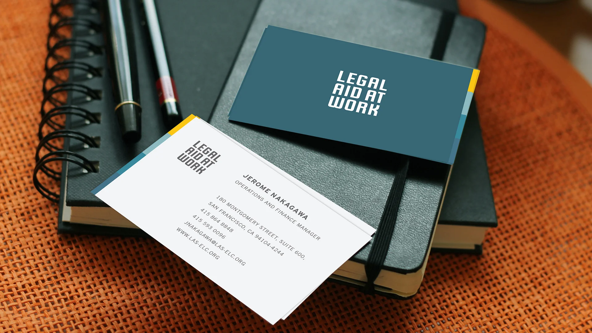
Business Card
Clean and direct style also applied to the Legal Aid at Work business card design. Minimizing the text color to the primary color blue with a stripe of secondary colors on the edge to represent the branding concept.
Other Projects You Might Like

Coach Concierge Branding

West Oakland Health Branding

Horizon Branding