Coach Concierge Logo Design
Coach Concierge is building an app that brings coaches, skaters and parents together in one place to communicate, schedule and pay for lessons. The project here is to create the Logo and brand identity to assist them to achieve their goal.
Since the name doesn’t really say much about ice skating here, to integrate some design elements that represent it will be a solution to relate ice skating with Coach Concierge.
Shape and Form

When exploring the visual for the logo, the skater’s beautiful figure, or the skating boots, or the tracks that left on the ice all came up to my mind. Compose ice skating trace to a form that is the acronym of Coach Concierge—CC—seems to be a very interesting idea. The geometric shape creates a simplicity look and feel, direct and recognizable.


Meanwhile, we need to make sure that all the logo will look good digitally, so we also applied them to the app icon to find the best fit for their brand.


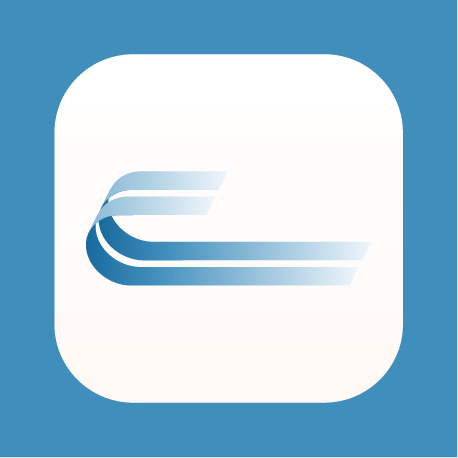

Then the winner logo is the most geometrically symmetrical one:


Color
The choice of color palette combines the cold and warm color, the cold color represents ice, and the warm color represents people, the gradient from cold and warm recreate the feeling of the coaching location.

Typography

App Design

Other Projects You Might Like

Legal Aid at Work Branding

West Oakland Health Branding

Horizon & Plan Bay Area Branding